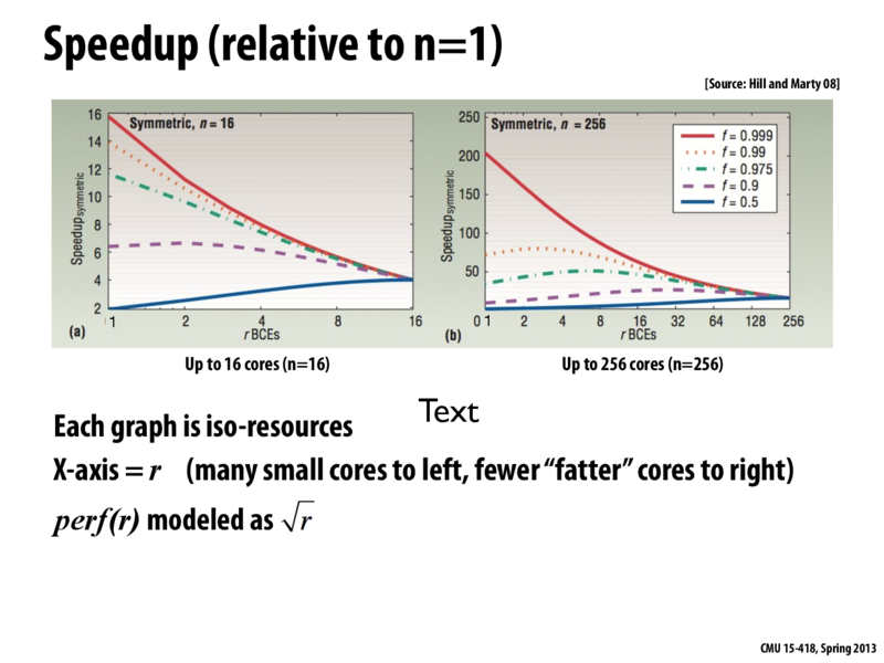
The red line (highly parallelizable workload) has decreasing speedup as you have fewer, bigger cores since they can't utilize the parallelism as much anymore since $perf(r)$ is modeled as $\sqrt{r}$. Originally we utilized all 16 cores ($n = 1$ per core) with $perf(1) = \sqrt{1} = 1$ unit of processing power each, but in the end we only use a single core ($n = 16$ per core) with $perf(16) = \sqrt{16} = 4$ units of processing power.
This comment was marked helpful 1 times.
mschervi
Question What does rBCE stand for? It took me a while of looking at these graphs to realize that # of cores did not increase along the x-axis; instead it decreases.
(And for some reason the text below the graph didn't help me. Maybe a graph with the x-axis flipped is more intuitive or similar to what we've seen so far?)
This comment was marked helpful 0 times.
kayvonf
BCE stands for "base core equivalents". That is, a core requiring r BCEs consumes r times the resources (think: transistors) as the experiment's "baseline" performance 1 core.
In each graph the total number of resources (in units of BCEs) is fixed at N. The x axis varies the size of the processor's cores, so a processor with cores each of size r has a total of N/r cores.
Varying the size of the cores trades off peak parallel performance for better sequential performance, and the curves on the graphs show how a specific workload's performance changes as this tradeoff is made.
These graphs are from the paper Amdahl's Law in the Multi-Core Era by Mark Hill (Univ. of Wisconsin) and Michael R. Marty (Google). It's definitely worth a read.
They also have a neat heterogeneous Amdahl's Law calculator and further slides about the paper here.
It may be also be helpful to see my explanation of the graphs on slide 6.
The red line (highly parallelizable workload) has decreasing speedup as you have fewer, bigger cores since they can't utilize the parallelism as much anymore since $perf(r)$ is modeled as $\sqrt{r}$. Originally we utilized all 16 cores ($n = 1$ per core) with $perf(1) = \sqrt{1} = 1$ unit of processing power each, but in the end we only use a single core ($n = 16$ per core) with $perf(16) = \sqrt{16} = 4$ units of processing power.
This comment was marked helpful 1 times.
Question What does rBCE stand for? It took me a while of looking at these graphs to realize that # of cores did not increase along the x-axis; instead it decreases.
(And for some reason the text below the graph didn't help me. Maybe a graph with the x-axis flipped is more intuitive or similar to what we've seen so far?)
This comment was marked helpful 0 times.
BCE stands for "base core equivalents". That is, a core requiring
rBCEs consumesrtimes the resources (think: transistors) as the experiment's "baseline" performance 1 core.In each graph the total number of resources (in units of BCEs) is fixed at
N. The x axis varies the size of the processor's cores, so a processor with cores each of sizerhas a total ofN/rcores.Varying the size of the cores trades off peak parallel performance for better sequential performance, and the curves on the graphs show how a specific workload's performance changes as this tradeoff is made.
These graphs are from the paper Amdahl's Law in the Multi-Core Era by Mark Hill (Univ. of Wisconsin) and Michael R. Marty (Google). It's definitely worth a read.
They also have a neat heterogeneous Amdahl's Law calculator and further slides about the paper here.
It may be also be helpful to see my explanation of the graphs on slide 6.
This comment was marked helpful 0 times.