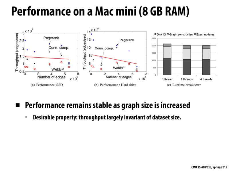
Could someone explain the graph with the red, black, and blue data points? What is the red, black and blue suppose to represent.
afzhang
I think the red, black, and blue data points are the performance for 3 different problems. Namely, blue corresponds to page rank, black corresponds to connected components, and red corresponds to whatever the WebBP problem is.
Faust
I believe @afzhang is correct here. the blue points are just the throughput of pagerank problem vs the number of edges, the red is the throughput of the WebBP problem vs the number of edges, and the black is the throughput of the connected components problem vs the number of edges we have. The red line just appears to be the best fit line, so we see how overall performance is affected.
abist
@Faust what do you mean by best fit line? I was thinking it was the average
Could someone explain the graph with the red, black, and blue data points? What is the red, black and blue suppose to represent.
I think the red, black, and blue data points are the performance for 3 different problems. Namely, blue corresponds to page rank, black corresponds to connected components, and red corresponds to whatever the WebBP problem is.
I believe @afzhang is correct here. the blue points are just the throughput of pagerank problem vs the number of edges, the red is the throughput of the WebBP problem vs the number of edges, and the black is the throughput of the connected components problem vs the number of edges we have. The red line just appears to be the best fit line, so we see how overall performance is affected.
@Faust what do you mean by best fit line? I was thinking it was the average