Just to add more clarity to the graphs above for the left graph, on the far left we have 16 cores with 1 resource per core (good for parallel work) and on the far right we have a single core with 16 resources (good for sequential execution). Obviously we want a mixture of skinny/fat cores to do well with both parallel and sequential work.
makingthingsfast
It's important to notice the trends in the blue and red lines. The red line shows the best performance. As we move from left to right, we go from a processor with tons of little cores to a smaller number of bigger cores. In this way, we are bettering the sequential execution at the cost of peak performance. This is a tradeoff much like with space and time.
misaka-10032
Is there any rationale behind modeling $perf(r) = \sqrt{r}$ ?
BensonQiu
It's interesting to see how much a small serial portion of code can slow down the entire program. For the graph on the right the program with f = 0.999 gets ~200x speedup with 256 cores, whereas the program with f = 0.99 gets only ~75x speedup with 256 cores.
stl
@misaka-10032 I believe the rationale behind modeling $perf(r) = \sqrt{r}$ is because adding more and more resources onto a core won't get you linear speedup since things that the resources add like branch prediction tap out.
maxdecmeridius
What exactly does r mean here? Is it the relative capability of each core?
kayvonf
@maxdecmeridius. r is the amount of chip resources used to create the "fat" (high single threaded performance) core on the chip. In the left graph, there are 16 total units of resources, so r=2 corresponds to a chip with 1 big core and 14 small cores. r=4 corresponds to a chip with 1 bigger core and 12 small cores.
maxdecmeridius
@kayvonf So r corresponds to chip real estate?
kayvonf
Yes, in the context of this discussion, that's a good interpretation. (e.g., r is proportional to number of transistors)
captainFlint
The graphs intuitively make sense since for an application that is almost completely parallelizable (the red line), we expect the speedup to be much greater on a processor where the 16 resources are shared across 16 cores as compared to the speedup achieved by a processor that has all 16 resources on one core. Similarly, for the blue line (since its much more serial than the red line), we expect the speedup achieved on a processor with one core (and all 16 resources) to be greater than that achieved on a processor with 16 cores (one resource each).
yimmyz
The two graphs really surprise me in a sense that when $f$ only drops to $0.9$ (still highly parallelizable program), the benefit of smaller & multiple cores becomes negligible. And, I guess that is partially the reason why the number of cores in consumer CPUs don't go too high, but for high-performance workstations / servers there are multiple (>8) cores.
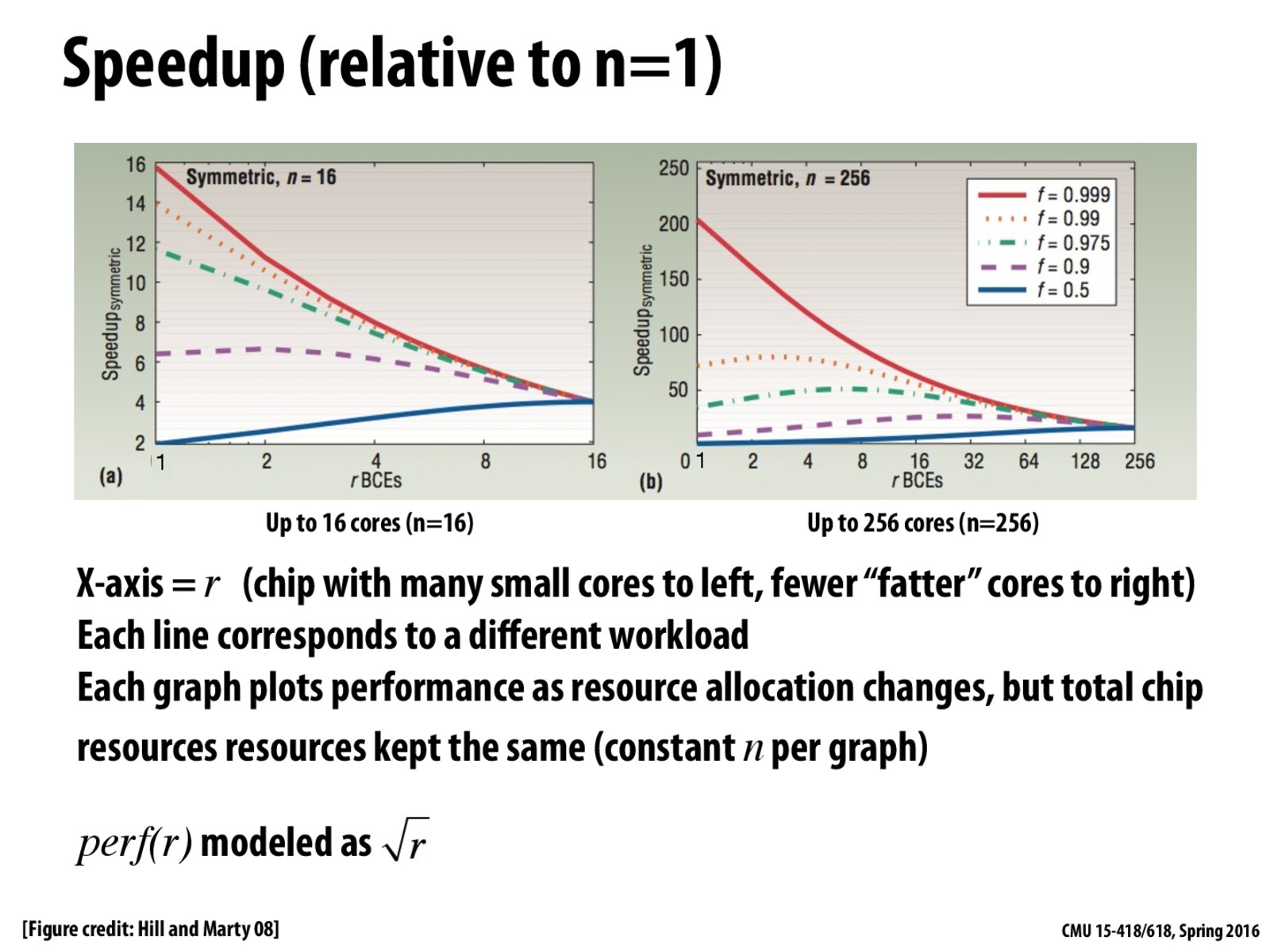
Here is how we get 4 for the red line on left using $perf(r) = \sqrt{r}$
$\frac{1}{\frac{0.5}{4} + \frac{0.5}{4\times1}} = 4$
Just to add more clarity to the graphs above for the left graph, on the far left we have 16 cores with 1 resource per core (good for parallel work) and on the far right we have a single core with 16 resources (good for sequential execution). Obviously we want a mixture of skinny/fat cores to do well with both parallel and sequential work.
It's important to notice the trends in the blue and red lines. The red line shows the best performance. As we move from left to right, we go from a processor with tons of little cores to a smaller number of bigger cores. In this way, we are bettering the sequential execution at the cost of peak performance. This is a tradeoff much like with space and time.
Is there any rationale behind modeling $perf(r) = \sqrt{r}$ ?
It's interesting to see how much a small serial portion of code can slow down the entire program. For the graph on the right the program with f = 0.999 gets ~200x speedup with 256 cores, whereas the program with f = 0.99 gets only ~75x speedup with 256 cores.
@misaka-10032 I believe the rationale behind modeling $perf(r) = \sqrt{r}$ is because adding more and more resources onto a core won't get you linear speedup since things that the resources add like branch prediction tap out.
What exactly does r mean here? Is it the relative capability of each core?
@maxdecmeridius.
ris the amount of chip resources used to create the "fat" (high single threaded performance) core on the chip. In the left graph, there are 16 total units of resources, so r=2 corresponds to a chip with 1 big core and 14 small cores. r=4 corresponds to a chip with 1 bigger core and 12 small cores.@kayvonf So r corresponds to chip real estate?
Yes, in the context of this discussion, that's a good interpretation. (e.g.,
ris proportional to number of transistors)The graphs intuitively make sense since for an application that is almost completely parallelizable (the red line), we expect the speedup to be much greater on a processor where the 16 resources are shared across 16 cores as compared to the speedup achieved by a processor that has all 16 resources on one core. Similarly, for the blue line (since its much more serial than the red line), we expect the speedup achieved on a processor with one core (and all 16 resources) to be greater than that achieved on a processor with 16 cores (one resource each).
The two graphs really surprise me in a sense that when $f$ only drops to $0.9$ (still highly parallelizable program), the benefit of smaller & multiple cores becomes negligible. And, I guess that is partially the reason why the number of cores in consumer CPUs don't go too high, but for high-performance workstations / servers there are multiple (>8) cores.