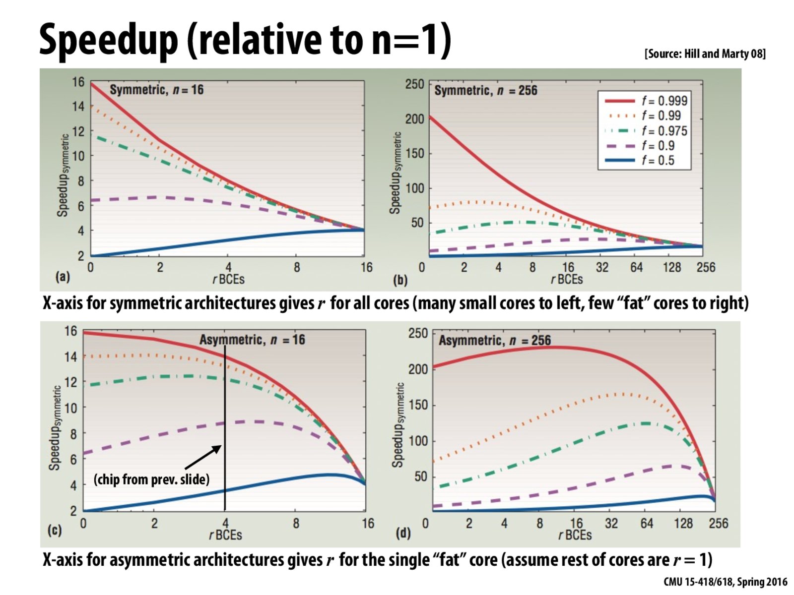
These graphs demonstrate the effect that processor design has on code performance.
On the X-axis, we have the relative performance offered per core. For instance, in Figure (a), the initial part of the graph corresponds to having 16 cores, each with (let's say) 1 compute capacity. The right side of the figure corresponds to reducing the number of cores while increasing the relative compute capacity of each core. So, the last data point corresponds to having just 1 fat core that offers 16 compute capacity.
The actual plots correspond to the speedups offered for codes with different amount of parallelism (given in the box in figure (b), larger f means more parallelism).
Figure (a) shows us that if we have a ton of parallelism in our code (f=0.999 or f=0.99), then we get maximum speedup by having many cores of relatively less compute capacity. However, as we go on increasing the capacity of each core, but also reduce the number of cores available, the performance of the parallel codes drops, but the performance of the code which has a large amount of serial code (f=0.5) now performs really well, since all it really wanted was a single powerful core to perform well!
Fantasy
For right side of figure(a), although the fat core has 16 computing units (maybe transistors), it only has 4 times performance of a core with single computing unit.
Some resources for a core are used for something like instruction fetching and branch predicting, so the computing capability of a core is far from linear with its transistors. Here, prof use a sqrt function to roughly characterize the relationship.
anonymous
For figure b, what is the reason that there is such a steep drop off with the most parallel code (solid red line). Also, why is the maximum speedup with the most sequential code (solid blue line), not at r=16?
bpr
@anonymous, in Figure b, the x-axis is how much space to give to each core. There is a total of 256 units of space (n=256). Thus at 256, each core uses 256 units of space, therefore there is only space for 1 core. Thus all of the lines converge to the same speedup. The same result was seen in Figure a, where the solid blue line maximized its performance at 16 out of 16 units of space.
aeu
I would like to state that these are the most confusingly structured graphs I have ever seen.
c0d3r
Could someone explain why in figure (d), the programs increase in speedup then drop dramatically at high values of r?
bpr
@c0d3r, the system is asymmetric. There is one large core that uses r units of space. The remaining units of space are parceled out as one 1 unit of space = 1 core. Most of the programs are highly parallel, so they benefit from having more cores. By not being at the left, the programs show some benefit from speeding up the serial portion of the program.
yangwu
on figure c, when n = 16, we can get 16x speedup, so can we assume in figure d, the workload cannot be perfectly distributed among 256 cores, and which is why there is a short increase at first?
These graphs demonstrate the effect that processor design has on code performance.
On the X-axis, we have the relative performance offered per core. For instance, in Figure (a), the initial part of the graph corresponds to having 16 cores, each with (let's say) 1 compute capacity. The right side of the figure corresponds to reducing the number of cores while increasing the relative compute capacity of each core. So, the last data point corresponds to having just 1 fat core that offers 16 compute capacity.
The actual plots correspond to the speedups offered for codes with different amount of parallelism (given in the box in figure (b), larger f means more parallelism).
Figure (a) shows us that if we have a ton of parallelism in our code (f=0.999 or f=0.99), then we get maximum speedup by having many cores of relatively less compute capacity. However, as we go on increasing the capacity of each core, but also reduce the number of cores available, the performance of the parallel codes drops, but the performance of the code which has a large amount of serial code (f=0.5) now performs really well, since all it really wanted was a single powerful core to perform well!
For right side of figure(a), although the fat core has 16 computing units (maybe transistors), it only has 4 times performance of a core with single computing unit.
Some resources for a core are used for something like instruction fetching and branch predicting, so the computing capability of a core is far from linear with its transistors. Here, prof use a sqrt function to roughly characterize the relationship.
For figure b, what is the reason that there is such a steep drop off with the most parallel code (solid red line). Also, why is the maximum speedup with the most sequential code (solid blue line), not at r=16?
@anonymous, in Figure b, the x-axis is how much space to give to each core. There is a total of 256 units of space (n=256). Thus at 256, each core uses 256 units of space, therefore there is only space for 1 core. Thus all of the lines converge to the same speedup. The same result was seen in Figure a, where the solid blue line maximized its performance at 16 out of 16 units of space.
I would like to state that these are the most confusingly structured graphs I have ever seen.
Could someone explain why in figure (d), the programs increase in speedup then drop dramatically at high values of r?
@c0d3r, the system is asymmetric. There is one large core that uses r units of space. The remaining units of space are parceled out as one 1 unit of space = 1 core. Most of the programs are highly parallel, so they benefit from having more cores. By not being at the left, the programs show some benefit from speeding up the serial portion of the program.
on figure c, when n = 16, we can get 16x speedup, so can we assume in figure d, the workload cannot be perfectly distributed among 256 cores, and which is why there is a short increase at first?