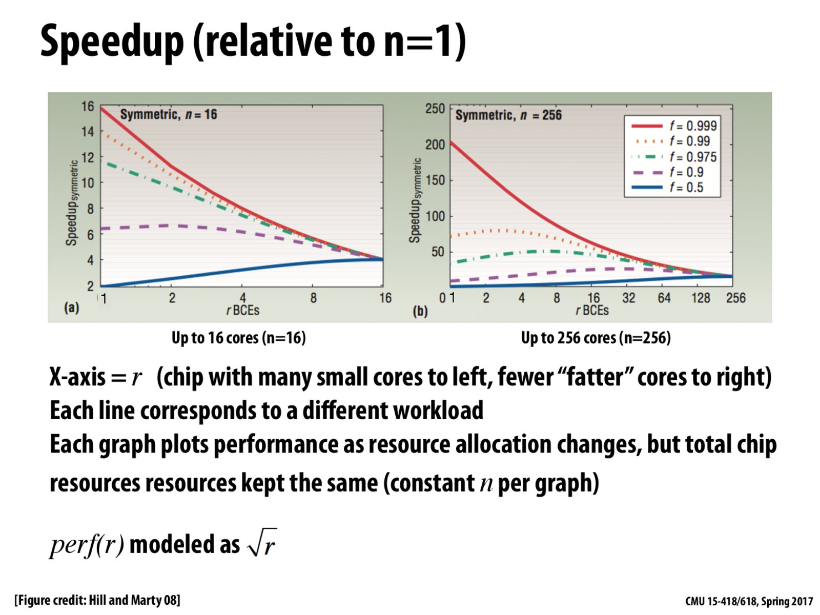
Why in the left graph does the red line go down as we move from left to right?
Answer from class:
Since f = 0.9999, this program is almost entirely parallelizable. This program gets a lot of use out of running on a machine with 16 cores, even if each of them is not as fast within a single-thread. So, we get a 16x speedup. As we move from 16 cores to 1 big, fancy core (running at 4 times the performance on a single-thread) we must do everything sequentially. So, we can't exploit the fact that the program is very parallelizable, and we can only run 4 times as fast.
jmc
It's important to bear in mind that perf(r) = \sqrt(r) is a rough model. We know that perf(r) = r would be too optimistic -- you cannot just keep building a linearly faster core with more transistors, as we saw when we looked at the history of processor design at the beginning of this class. Does anyone know if there is a more principled explanation for modelling perf(r) as \sqrt(r)?
bochet
In what sense is the plot symmetric?
Edit:
Oh, looking at next slide, I think symmetric means each processor will have same performance.
kayvonf
@bochet. Yes, "symmetric" refers to the fact that these graphs are modeling the performance of symmetric (homogeneous) multi-core processors.
atadkase
I suppose the figure on the right shows the tyranny of Amdahl's law. Even a 0.009 difference in the parallelism of the code reduces the speedup to half.
fxffx
The graph shows that many small cores will have significantly better speedup for parallel programs compared to program that's largely sequential. For fewer large cores, the different becomes smaller.
Why in the left graph does the red line go down as we move from left to right?
Answer from class: Since f = 0.9999, this program is almost entirely parallelizable. This program gets a lot of use out of running on a machine with 16 cores, even if each of them is not as fast within a single-thread. So, we get a 16x speedup. As we move from 16 cores to 1 big, fancy core (running at 4 times the performance on a single-thread) we must do everything sequentially. So, we can't exploit the fact that the program is very parallelizable, and we can only run 4 times as fast.
It's important to bear in mind that perf(r) = \sqrt(r) is a rough model. We know that perf(r) = r would be too optimistic -- you cannot just keep building a linearly faster core with more transistors, as we saw when we looked at the history of processor design at the beginning of this class. Does anyone know if there is a more principled explanation for modelling perf(r) as \sqrt(r)?
In what sense is the plot symmetric?
Edit: Oh, looking at next slide, I think symmetric means each processor will have same performance.
@bochet. Yes, "symmetric" refers to the fact that these graphs are modeling the performance of symmetric (homogeneous) multi-core processors.
I suppose the figure on the right shows the tyranny of Amdahl's law. Even a 0.009 difference in the parallelism of the code reduces the speedup to half.
The graph shows that many small cores will have significantly better speedup for parallel programs compared to program that's largely sequential. For fewer large cores, the different becomes smaller.