Just curious, how were these data collected/measured?
This comment was marked helpful 0 times.
tomshen
Well, here's the paper these graphs are from. I don't think they were generated from actual data, but from the Matlab code linked on this page. There's also an interactive speedup graph generator there, which is pretty neat.
This comment was marked helpful 0 times.
ycp
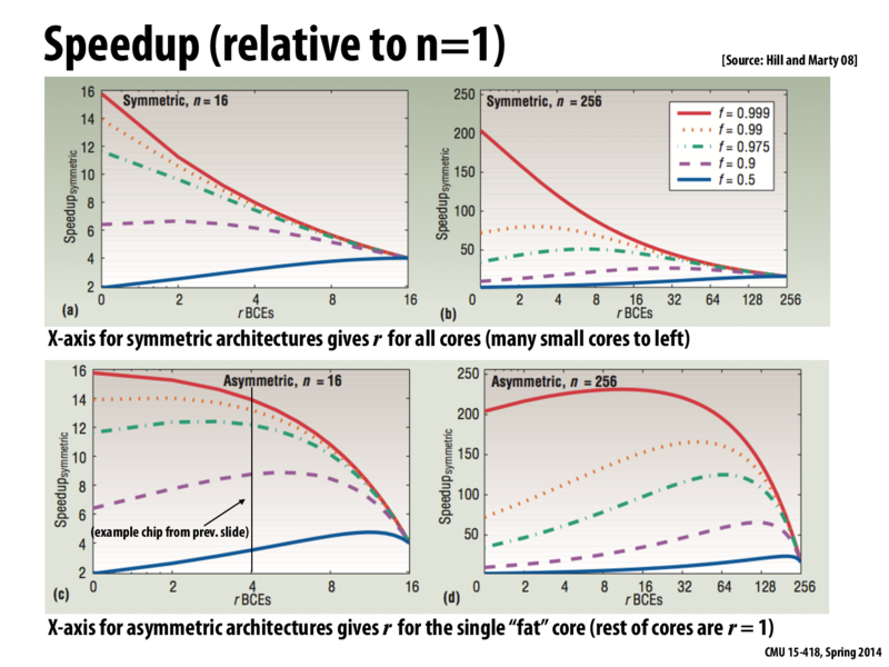
So I remember that a comment was made in class and I think it was actually very important to bring up again on the slides. When looking at these graphs, when thinking about the actual numbers, that x-axes on the graphs represent different things. On the top row, rBCEs=4 means that there are 4 cores with 4 units of resources. However, on the bottom row, rBCEs=4 means that the biggest core has 4 units of resources but there are 12 other cores with just a single resource. So, it is true that the speedup seems to be a lot higher in the bottom row pretty much across the board, but the number of processors being used is so different. In fact for rBCEs=4, we just showed that there are 3 times more cores in the bottom row. Thus, take this graph with a grain of salt. There a lot of ways to analyze this graph, but I think the key piece of information here is simply that there something to gain by having heterogeneous cores.
Just curious, how were these data collected/measured?
This comment was marked helpful 0 times.
Well, here's the paper these graphs are from. I don't think they were generated from actual data, but from the Matlab code linked on this page. There's also an interactive speedup graph generator there, which is pretty neat.
This comment was marked helpful 0 times.
So I remember that a comment was made in class and I think it was actually very important to bring up again on the slides. When looking at these graphs, when thinking about the actual numbers, that x-axes on the graphs represent different things. On the top row, rBCEs=4 means that there are 4 cores with 4 units of resources. However, on the bottom row, rBCEs=4 means that the biggest core has 4 units of resources but there are 12 other cores with just a single resource. So, it is true that the speedup seems to be a lot higher in the bottom row pretty much across the board, but the number of processors being used is so different. In fact for rBCEs=4, we just showed that there are 3 times more cores in the bottom row. Thus, take this graph with a grain of salt. There a lot of ways to analyze this graph, but I think the key piece of information here is simply that there something to gain by having heterogeneous cores.
This comment was marked helpful 0 times.