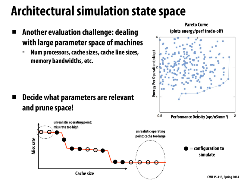
Explanation of Pareto curve:
See that graph in the top right?
The left axis is essentially "How expensive is each operation, in terms of power?".
The right axis is essentially "How many operations are we trying to run in a small amount of time and space?"
The "Pareto curve" is the curve along the bottom right -- it minimizes energy usage, and maximizes performance + density. Each of the blue dots could represent a different chip design, and the chips in the bottom right would provide the best benefits with the lowest cost (where cost is measured in terms of nanojoules per operation).
This comment was marked helpful 0 times.
wcrichto
Also interesting to think about here: the Pareto distribution (note that the name in the slides has a typo) isn't specific to GPU performance but actually a probability distribution which can be used to model a wide variety of phenomena.
It seems like the Pareto curve referenced in the slides is actually a backwards Pareto distribution.
This comment was marked helpful 1 times.
yanzhan2
For the cache size and miss rate curve, different benchmarks would have different working sets. So should the curve be the average of some benchmarks?
This comment was marked helpful 0 times.
kayvonf
@yanzhan2. Absolutely, the curve is dependent on the workload. So in designing and architecture it would be wise to consider average-case performance over a collection of important workloads.
This comment was marked helpful 0 times.
sbly
@wcrichto Ah I was wondering about that, I thought the names were just really similar. Do you know why this is called the Pareto curve? The fact that it looks like a backwards Pareto distribution just seems like a coincidence with this particular example. Is there any mathematical reason why these curves look like backwards Pareto distributions?
This comment was marked helpful 0 times.
Yuyang
@sbly @wcrichto
It is apparently because this economist Pareto guy has two major contributions:
One is the beloved Pareto distribution :D the other is
Pareto Optimality.
Explanation of Pareto curve: See that graph in the top right? The left axis is essentially "How expensive is each operation, in terms of power?". The right axis is essentially "How many operations are we trying to run in a small amount of time and space?"
The "Pareto curve" is the curve along the bottom right -- it minimizes energy usage, and maximizes performance + density. Each of the blue dots could represent a different chip design, and the chips in the bottom right would provide the best benefits with the lowest cost (where cost is measured in terms of nanojoules per operation).
This comment was marked helpful 0 times.
Also interesting to think about here: the Pareto distribution (note that the name in the slides has a typo) isn't specific to GPU performance but actually a probability distribution which can be used to model a wide variety of phenomena.
It seems like the Pareto curve referenced in the slides is actually a backwards Pareto distribution.
This comment was marked helpful 1 times.
For the cache size and miss rate curve, different benchmarks would have different working sets. So should the curve be the average of some benchmarks?
This comment was marked helpful 0 times.
@yanzhan2. Absolutely, the curve is dependent on the workload. So in designing and architecture it would be wise to consider average-case performance over a collection of important workloads.
This comment was marked helpful 0 times.
@wcrichto Ah I was wondering about that, I thought the names were just really similar. Do you know why this is called the Pareto curve? The fact that it looks like a backwards Pareto distribution just seems like a coincidence with this particular example. Is there any mathematical reason why these curves look like backwards Pareto distributions?
This comment was marked helpful 0 times.
@sbly @wcrichto
It is apparently because this economist Pareto guy has two major contributions:
One is the beloved Pareto distribution :D the other is Pareto Optimality.
This comment was marked helpful 0 times.